
George Zachary Blecher
Based in Los Angeles, George Blecher is a talented multi-instrumentalist specializing in guitar, bass, piano, and ukulele.
He is looking to expand his client base and land more gigs.
The Situation
The Problem:
George's previous website wasn’t gaining much traction and didn’t offer potential clients enough information about him.
The Goals:
-
Increase website traction and gain clients and gigs
-
Help users find a talented musician!
-
Use SquareSpace website builder
-
Stakeholder contract
Duration:
-
June 2024 to August 2024
The Solution
My solutions involve:
-
Refined website copy
-
Clearer access to his biography, booking information, and music
-
Redesigned style guide
Over a couple of months, the redesign increased his website's traffic by 58% and decreased its exit rate by 22%.
Original website


Research
Stakeholder interview
The project begins with a stakeholder interview. I ask George about key points of the project such as:
-
What is the purpose of his website?
-
Does he have a business model I should be aware of?
-
What does success look like to him (KPIs)?
-
What are the project constraints?
-
Can he walk me through his current website? (What does he like or dislike about the current design?)
-
Are there any websites he’d like me to use as inspiration?
-
Who is his current clientele, and who does he want to attract?
In sum, his website's purpose is to:
-
Showcase his services, professionalism, and qualifications
-
A way for potential clients to learn about and contact him
-
He operates on a freelance basis so more clients = more income
-
Clients are looking for a music instructor or gig musician
User interviews and affinity mapping
Having this information, I turn my attention to understanding his clients.
After conducting user interviews, I synthesize my findings to uncover their needs and motivations, paying particular attention to what they expect from a freelance musician and instructor.

Define
User and problem
Using user stories and problem statements, I create and get to know the personas, Sophie and Barry.


Sophie's statement:
"As someone looking for a freelance musician to team up with, I want to know more about the musician so that I can confidently request their services.
The information and traits I need to know about them include their reputation, reliability, professionalism, music style and overall aesthetic, personality and attitude, rates, and availability."
Barry's statement:
"As someone seeking a music instructor, I want to learn more about the instructor to ensure they are the best fit for me.
The information and traits I value in an instructor are their reputation and educational background, reliability, professionalism, music style, personality and attitude, rates, availability, and location."
Analyze
Heuristic analyses
I conduct a heuristic analysis of George's current website, along with a review of competitors' sites, looking for opportunities to improve and enhance the user experience. Throughout this process, I consider the perspectives of the UX Designer, as well as Sophie, Barry, and George, ensuring every viewpoint is represented.
Competitor analyses
Solo artists
I look at independent artists' websites to see how they appeal to an audience.


Music instructors

Key takeaways
-
IA = Common page categories include Tour/Shows/Events, Music/ Discography, Store, About, Contact, Sessions/Lessons
-
UI and Visual Design = Common elements include hero images of artist or album artwork, socials icons, music video thumbnails, testimonials, newsletters, simplicity is best, instructors' sites are text heavy

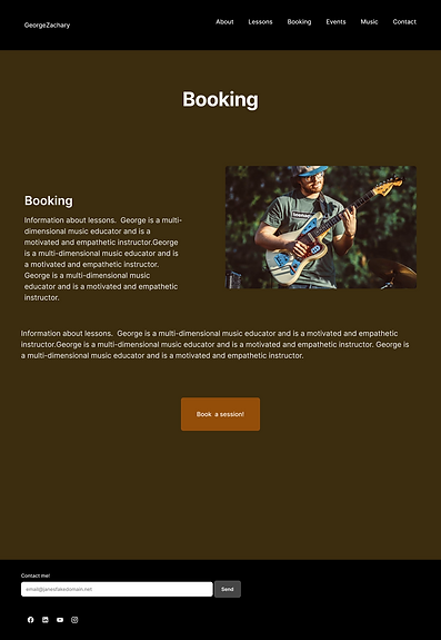
Original website

Key takeaways
-
Clarity and context- copy needs to provide more context and details
-
Need stronger CTAs
-
Missing services pages- showcase upcoming events and info about services provided

Content audit
Looking at my findings from the heuristic analyses, I parse through George's website and document:
1. What important information is missing? Any information we can remove?
2. How can the content be organized in the most efficient way (categories, hierarchies, labeling)
These results help with the sitemap, more about this after HMW questions.
Ideate
Ask HMW
(How Might We)?
At this point, I have a solid understanding of Sophie and Barry, the current state of the website, and the challenges we face. Next, I craft my HMW (How Might We) questions to help me ideate.

Information Architecture
I compile all the necessary elements based on my analyses, audit, and HMW responses, then organize and refine them. Additionally, I create user flows to visualize Sophie’s and Barry’s journeys. All of this culminates in the creation of the sitemap.

Sketches
Referring to the sitemap, I begin sketching the website.


Prototype
Wireframing
& Prototyping
It's time to put everything into action and wireframe my first iteration!


Change in direction
I meet with George to present the first version of high-fidelity wireframes. During our conversation, he informed me that he no longer wants a dedicated page for booking lessons. Instead, he’d like a single page that mentions both gigs and teaching lessons.

The purpose of the page is now focused on the concept of booking time with George. After a couple of rounds of sketching and hypothesizing what terminology should be used, I created a page that presents all services offered by George Zachary Blecher.

Test
Testing and more
First round of usability testing
I conduct usability testing sessions with the first version of the website.
Key takeaways:
-
The color brown is not favorable
-
Boring layout
-
Bad quality photos
Style Guide
I planned to keep the existing style guide, but user testing revealed that the color brown was not a fan favorite, which led to an updated style guide.

Stakeholder meeting
The significant findings and change of style guide require another meeting with George.
When discussing the "Booking" page, George mentions that advertising his teaching services is a breach of contract with a company he works for. However, he still wants users to know that he teaches and where.
This presented a challenge, but the overall decision was to briefly mention it in his bio
Iterations Round II
Iterations made are:
-
Change style guide
-
Removal of “Lessons” section


Testing Round II
Second round of usability testing
I conduct usability testing sessions with the second version of the website and find that:
-
Solved visual design issues
-
New issue: lengthy descriptions
-
New issue: 66% confused by music section title layout
Iterations Round III
Iterations made:
-
Change layout for "Music" page, Now mentions band title, the genre and instrument(s) he plays, and then a bio of the band
-
Shortened bio
-
Gave the user more opportunities to contact George


Conclusion
The redesign brought clearer access to George's bio, booking information and music, in addition to exposing the need for a more appealing visual design. This redesign increased user engagement. His website saw a 58% traffic increase and the site’s overall exit rate decreased by 22%.
There were some unique challenges along the way, such as the influence of website templates and stakeholder contract restrictions. However, these obstacles, combined with George’s amazing personality, made this a truly memorable project!

Video of homepage scroll

Video of homepage navigation